The single most-asked question about the brat aesthetic is "what font is that?" The answer is short: Arial Narrow Bold, lowercase, with a soft gaussian blur. The longer answer — including the color codes, the blur settings, and the free font alternatives — is what this guide covers.
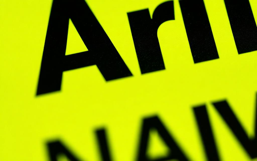
the official brat font
The brat album cover uses Arial Narrow Bold. It is one of the most boring, ubiquitous fonts in the world — installed by default on practically every Mac, PC and phone shipped in the last 30 years. That is part of why the aesthetic spread so fast: anyone could rebuild it using software they already had.
the exact color codes
There is only one correct green. The official brat color is #8ACE00, which is RGB(138, 206, 0) or HSL(80, 100%, 40%). The text is pure black, #000000. Do not use a softer green, do not use dark grey for the text. Match these exactly or the cover reads as "off" to anyone familiar with the source.
the blur is part of the font
What makes the brat font look like the brat font is not just the typeface — it is the gaussian blur applied on top. On a 2000-pixel square canvas, that blur is somewhere between 2 and 3 pixels. Soft enough that the letters are still readable, sharp enough that the word still hits.
If you are recreating this in Photoshop or Figma, the blur is the last step. Type the word, center it, then apply gaussian blur to the text layer only — not the background.
free font alternatives
If Arial Narrow is not installed on your system, these free alternatives produce a near-identical result:
- Oswald Bold (Google Fonts) — slightly more condensed but reads the same at brat-cover size.
- Roboto Condensed Bold (Google Fonts) — wider than Arial Narrow but works in a pinch.
- Bebas Neue (Google Fonts) — taller and more dramatic, useful for shorter words.
- Barlow Condensed (Google Fonts) — the closest free match for Arial Narrow Bold.
The brat generator uses Arial Narrow with a smart fallback stack, so you do not have to think about any of this — it handles the font for you on every device.
letter case and spacing
Always lowercase. Always default tracking — do not stretch or compress the letters. The "designed" version of the brat aesthetic, with weird kerning and custom spacing, looks wrong. The whole point is that it feels accidental.
summary
Font: Arial Narrow Bold. Color: #8ACE00. Text: lowercase. Blur: 2-3 px. Composition: centered, lots of empty space. Get those five things right and your cover is indistinguishable from the source. Or skip the work and use the brat generator, which handles all of it.